
PowerPoint Tactics: Part 5 - Graphical slides
Now consider a similar dilemma for a more graphically oriented slide. Engineering problems tend to lend themselves to being described with diagrams, some of which can become quite complicated.
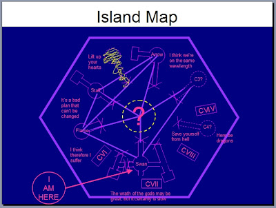
Figure 7: An example of a bad diagram slide (click to enlarge)
Figure 7 depicts a very detailed diagram that, like the first text example shown, is visually distracting and fails to convey information concisely. The first tip for graphical slides is obvious: keep them as simple as possible. There will be occasions, however, when a complicated situation requires a complex diagram. Then what do you do?
A good approach for problems like these is to “layer” your graphic. Instead of presenting the audience with all the information in the diagram at one time and allowing them to decide the order in which they view and attempt to decipher the data, divide the information into layers and add one at a time. Then explain the details that each adds slide to the overall picture as you progress. For example, take Figure 8:
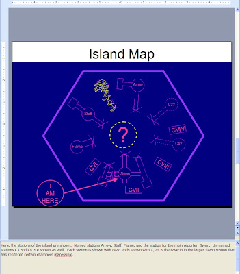
Figure 8: The first layer of a complex diagram slide, with notes (click to enlarge)
It presents a digestible subset of the data shown in the very complicated Figure 7, namely landmarks found on the island. Explain this layer fully, perhaps with details of each landmark and its suspected use. Now, however, this first set of facts is isolated from the other pieces of information allowing the listener to focus on a subset of the ideas you are trying to convey. Like in the text example, note the use of speaker notes again to provide detail.
After the audience is clear on this subset of the information, the next layer is shown, as in Figure 9:
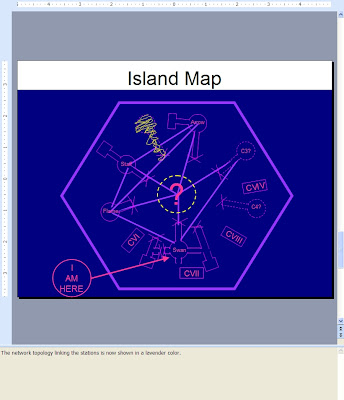
Figure 9: The first and second layers, with notes (click to enlarge)
Here, the communication connections between the landmarks are shown and can be explained separate from the landmarks themselves shown in the previous slide. The audience has had a chance to understand the landmarks and will focus their attention on the items that have been added to the picture, as intended.
Finally, a third layer is added to form Figure 10:
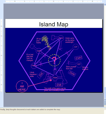
Figure 10: The full diagram, now with notes
Graphically, it is identical to Figure 7, but now the layers of information have been isolated and presented separately instead of all at once, achieving clarity that was absent when because the audience controlled the order in which information was consumed. Now when they are shown the final picture, listeners have more context around what they are seeing and have had intermediary steps explained to them in detail. This vastly improves the chance that the complicated graphical slide will deliver the intended ideas.
One aspect of PowerPoint you might consider when layering a complex diagram is the animated graphical elements feature. When shown in “slide show” mode, boxes, text, circles, and whatever else might be present on your slide can be made to appear in a certain order and using different appearance techniques, most of which are familiar to anyone who has done any video editing (fades, fly-in, etc.). Be careful when considering such an approach. Although it is tempting to use this feature, the elements and their appearance animations can be difficult to maintain. Also, utilizing animation in this manner requires use of “slide show” mode, which might work fine when you are presenting the materials live, but might not be used by audience members later with their local copies. Although maintenance still can be difficult, a better approach is to have separate slides that have progressively more elements on them until the entire detail of the final graphic is created.
- Part 1 - A tree in the woods is like an engineer with PowerPoint
- Part 2 - Apple anecdote
- Part 3 - Slide organization
- Part 4 - Text based slides
- Part 5 - Graphical slides
- Part 6 - Synchronizing to your agenda and using backup slides
- Part 7 - Oral delivery tips
- Part 8 - Final Thoughts
Labels: Reference


0 Comments:
Post a Comment
<< Home